Boise State Online Digital Ad Redesign


Role: Project lead and graphic designer
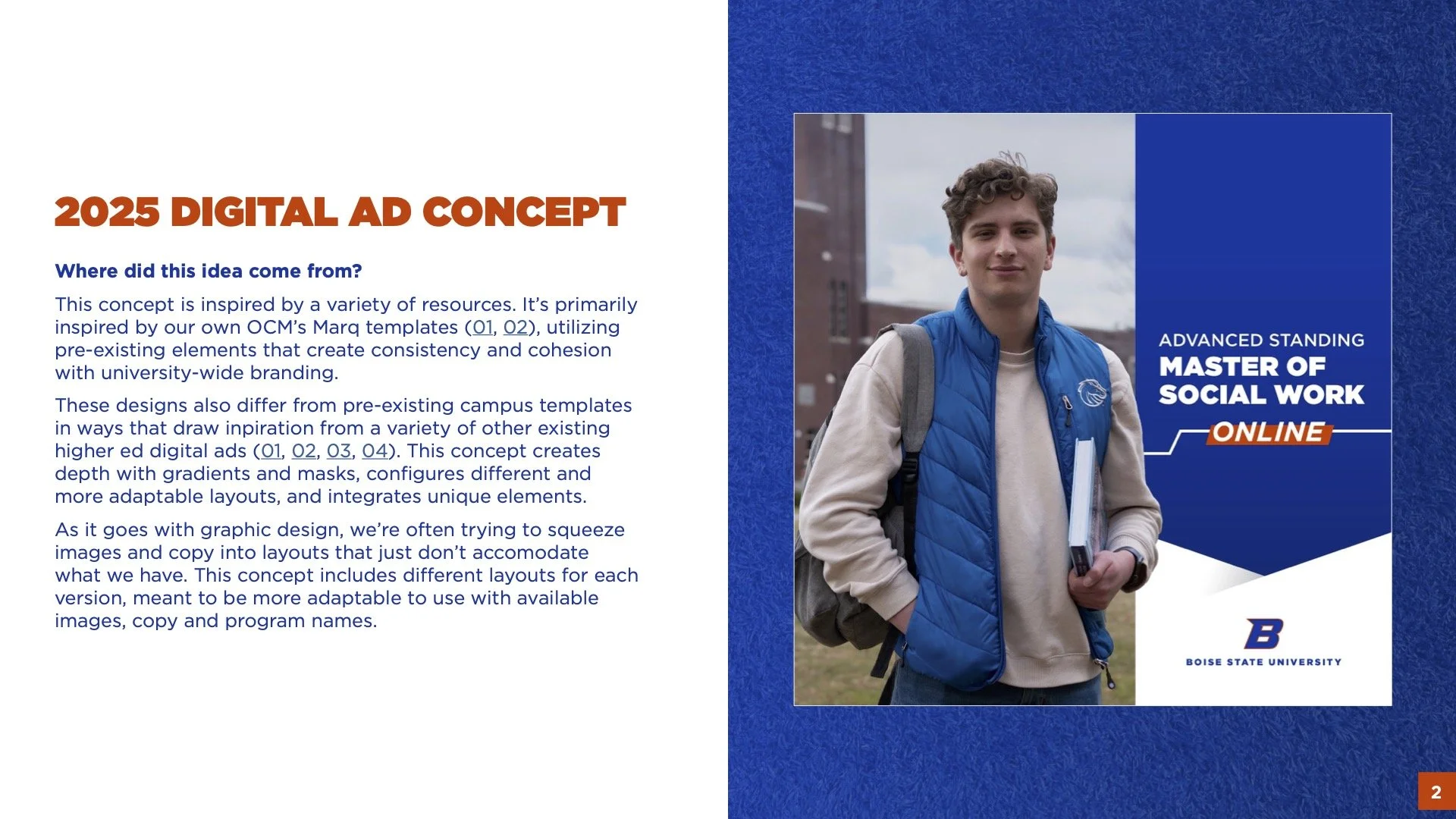
Boise State Online’s digital ad templates needed a revamp and a redesign. The previous ads were causing some ad fatigue, and they were difficult to use with photos and long program names, often cutting off important parts of photos and creating awkward inconsistencies. I kicked off the project by conducting market research, creating a mood board, opening up the research phase to the entire marketing department, and by hosting a conversation with the creative team to establish a visual direction.
Design Choices
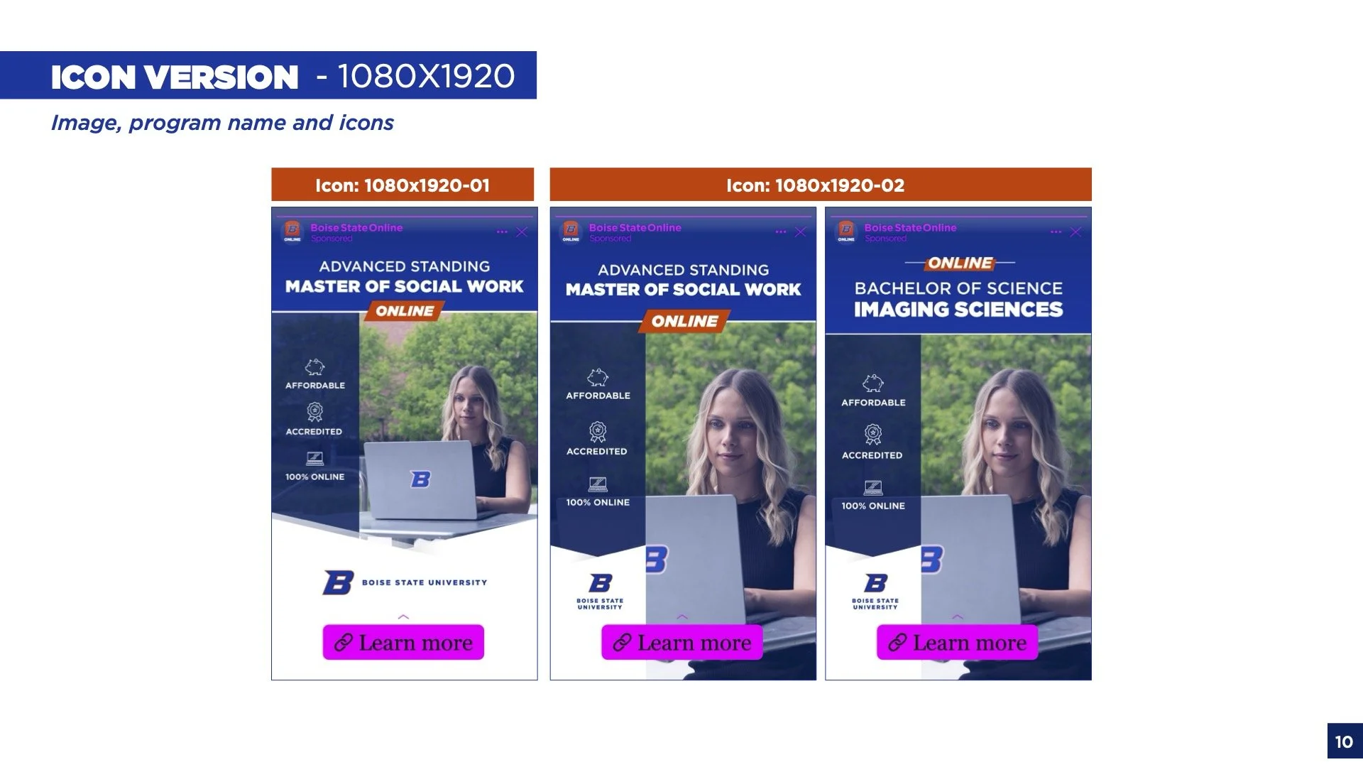
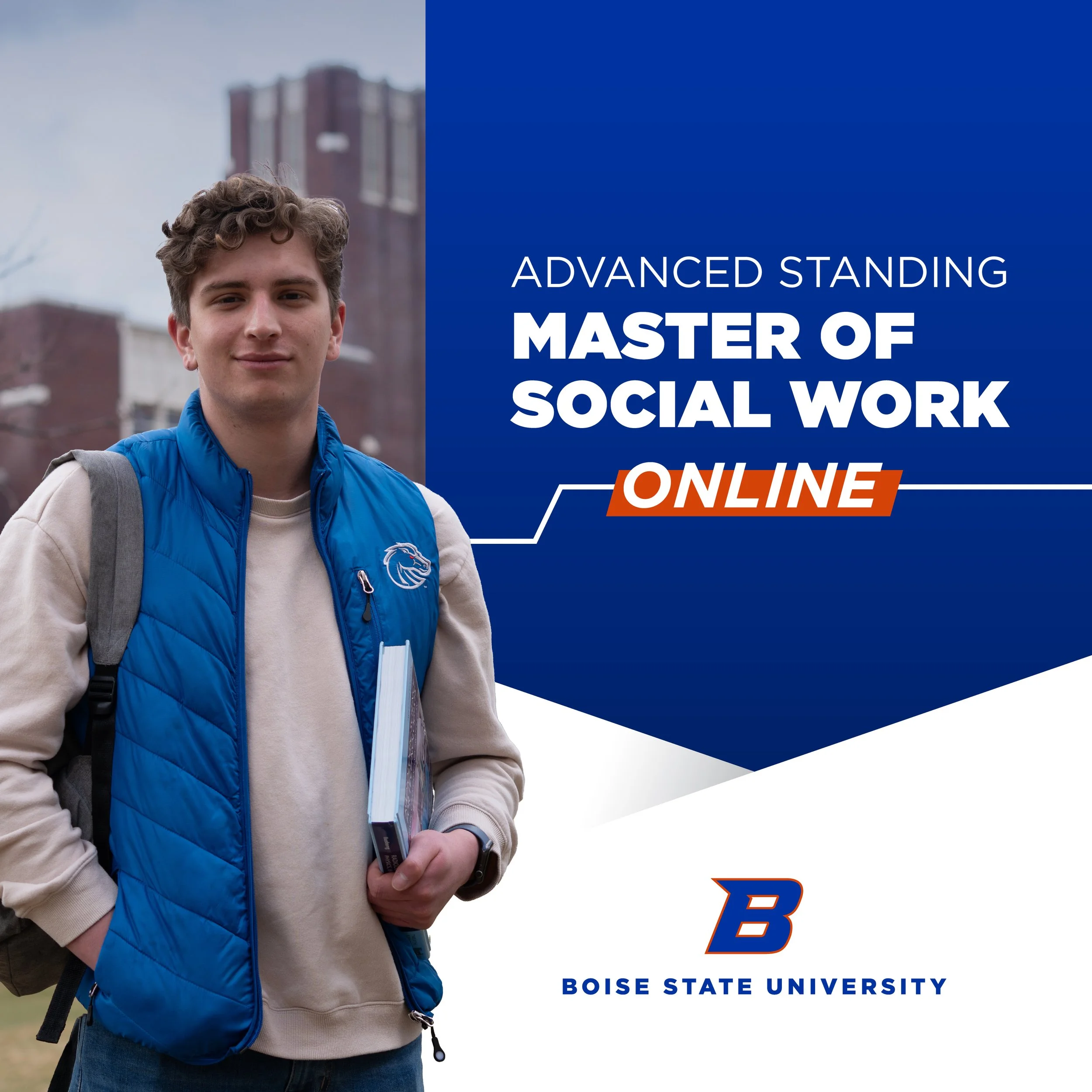
Boise State already has a brand, so instead of reinventing it, I utilized elements that had already been used across the brand. For instance, the orange highlight was previously only used sparingly; I saw the revival of this element as a great solution to emphasize “online”.
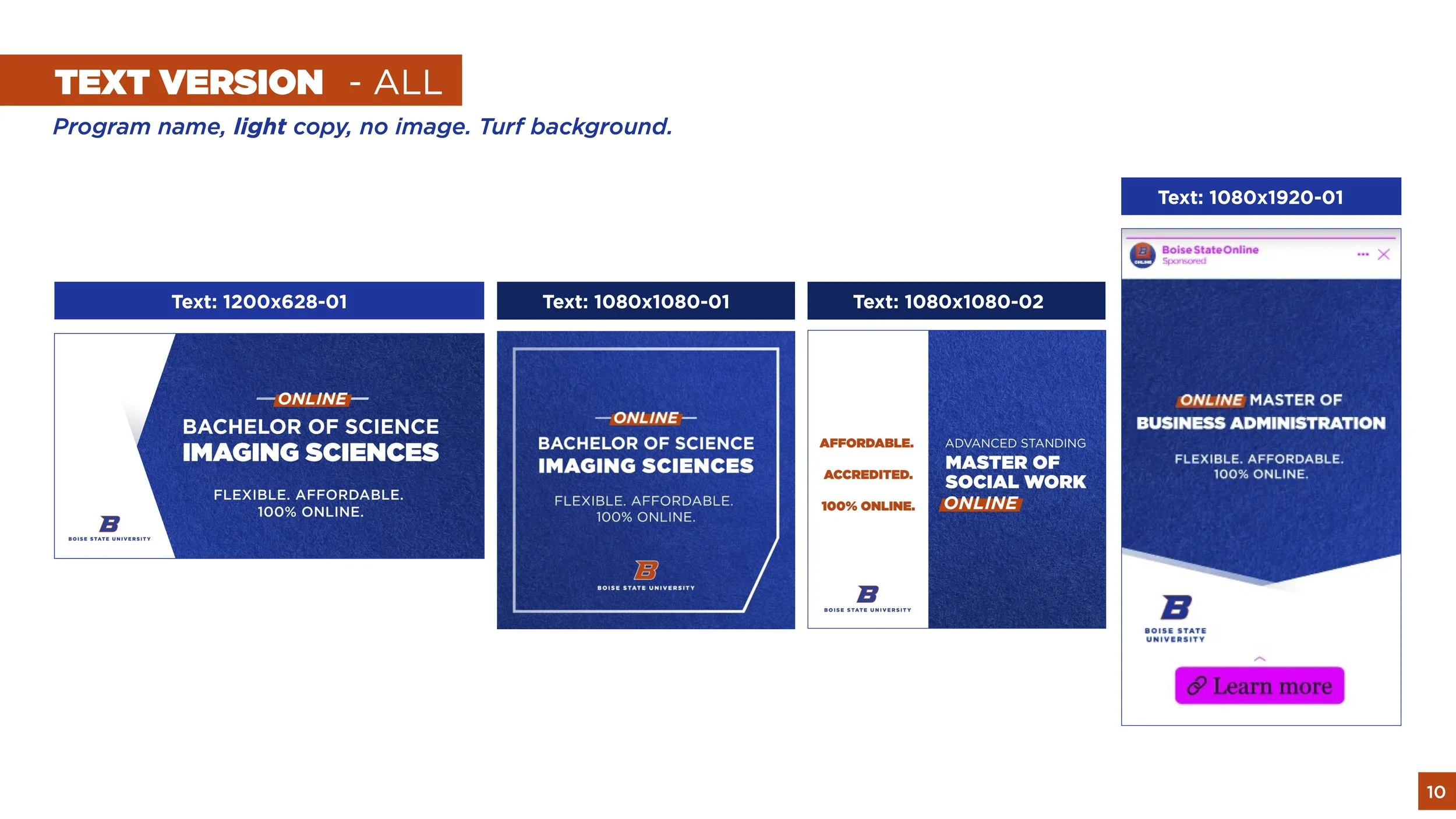
The blue turf was an element that had been used before, but it was challenging to read the copy that was over it because the turf was so bright and contrasty. Instead of getting rid of it, I added a gradient over it that would make it more subtle to use as a texture.
In addition to gaining inspiration from conducting market research, adding gradients and masking out the subject for some overlay effects really brought the ads to a more modern aesthetic.
The prior Boise State advertisements were created before my employment, so I used this redesign as a chance to add a more cohesive and modern aesthetic. Below you will see how I was able to spruce up their look in the redesign.
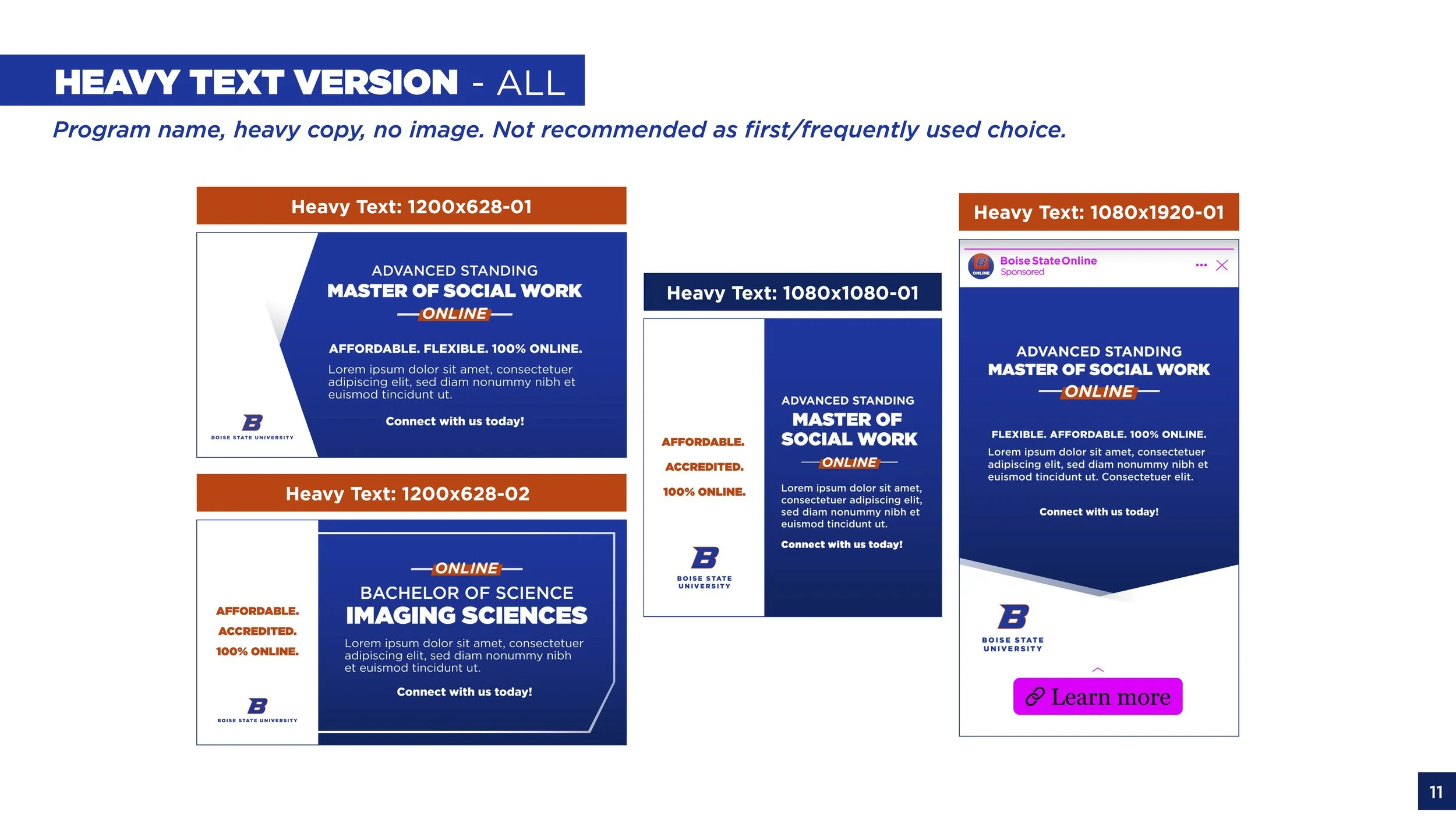
Text Ads:
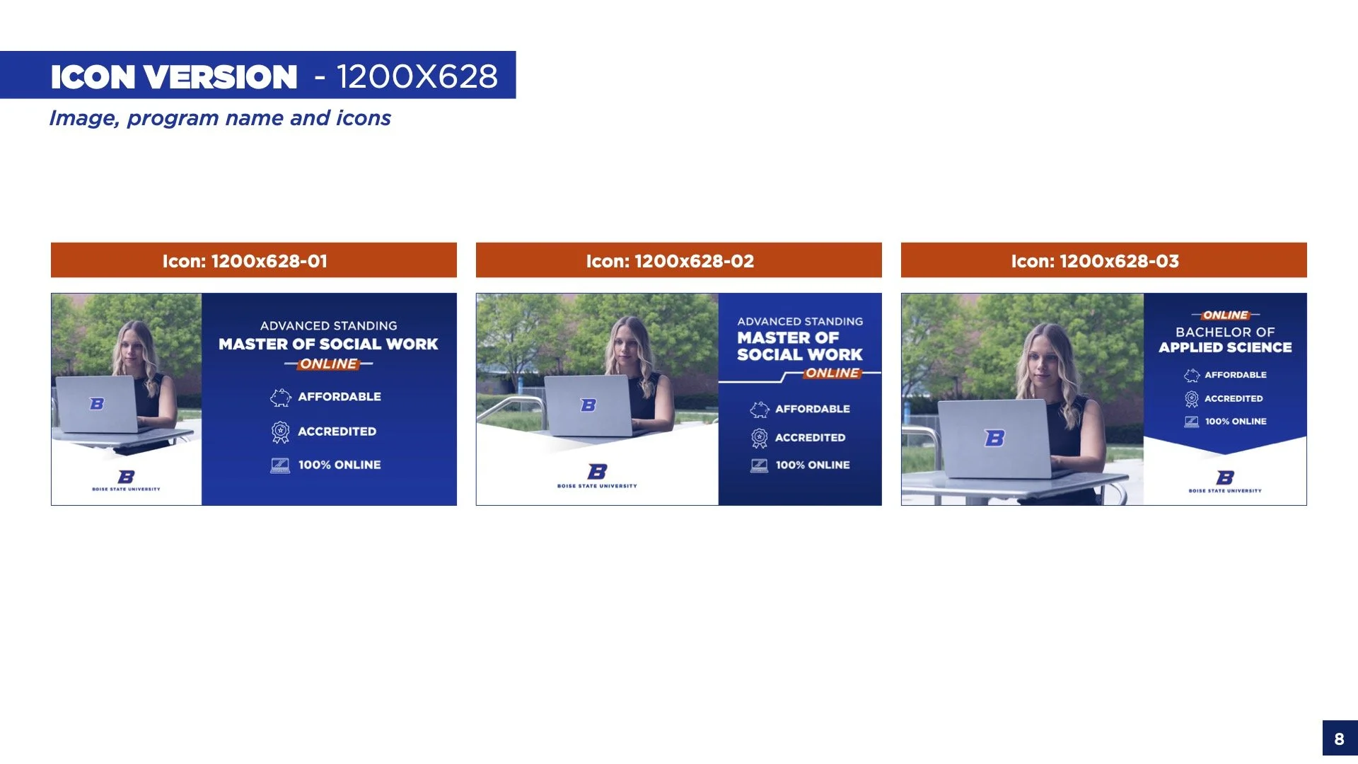
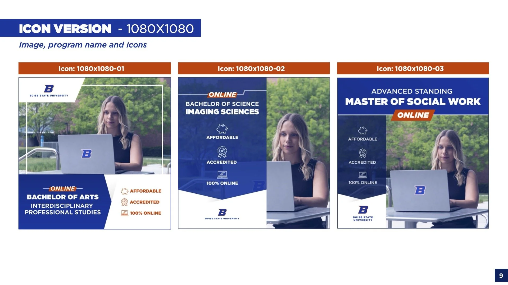
Icon ads
An Additional Turf Texture:
Below you’ll see how I created another version of the turf texture that could be easier use as a background with text on it.

→
Continuity in other ads
When tasked with creating more brand new ads, I remained consistent with this design concept for other ads that might be floating around out there.
A Complete Guide
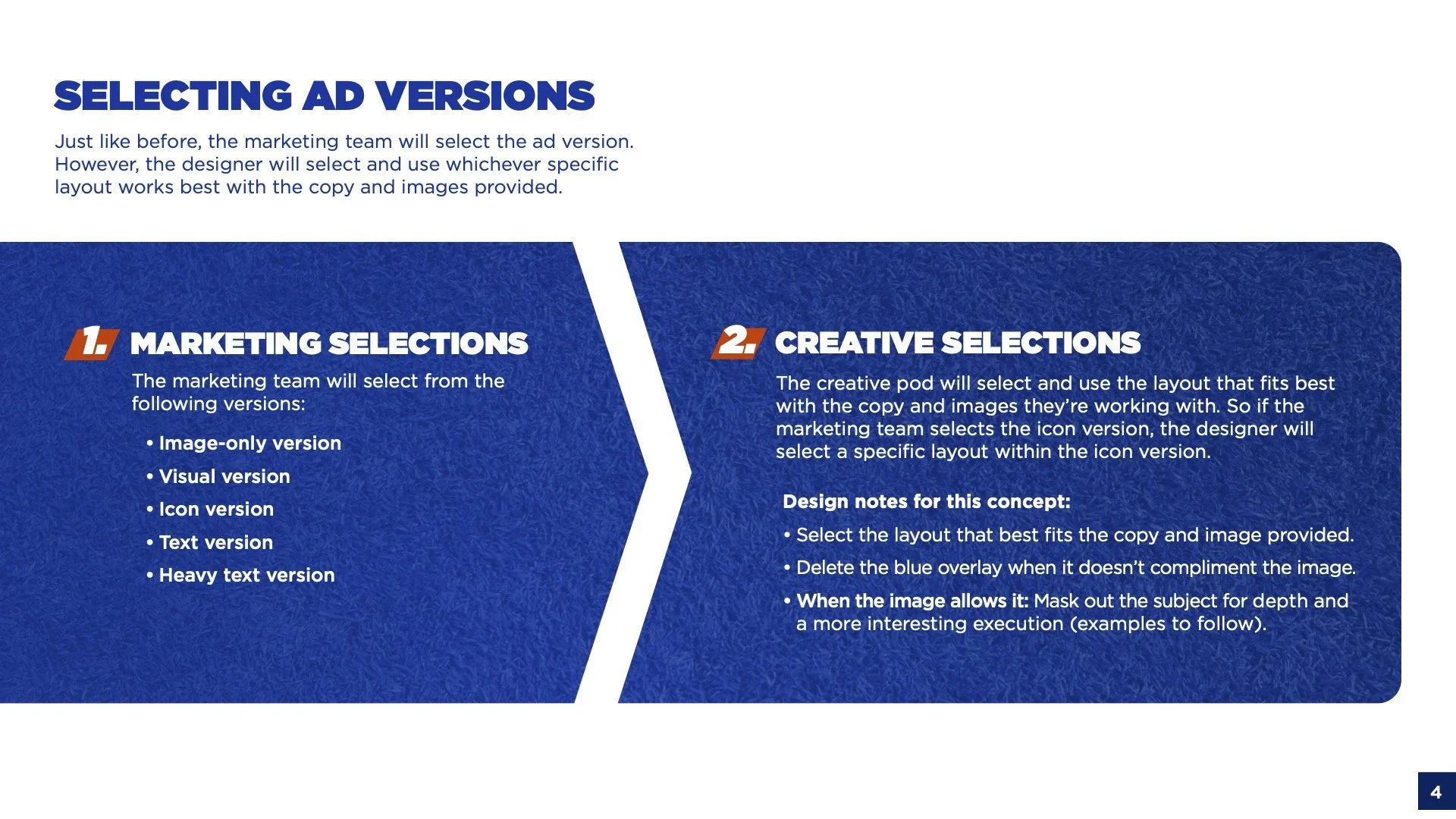
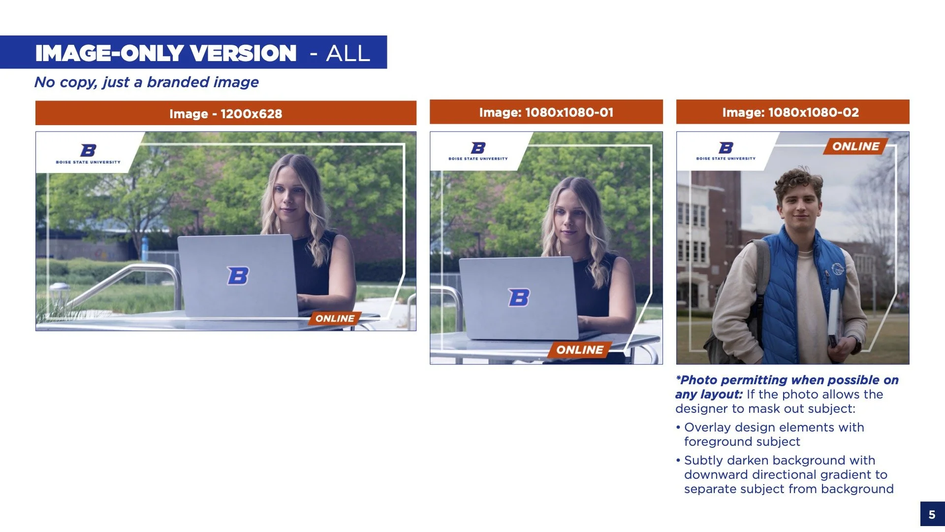
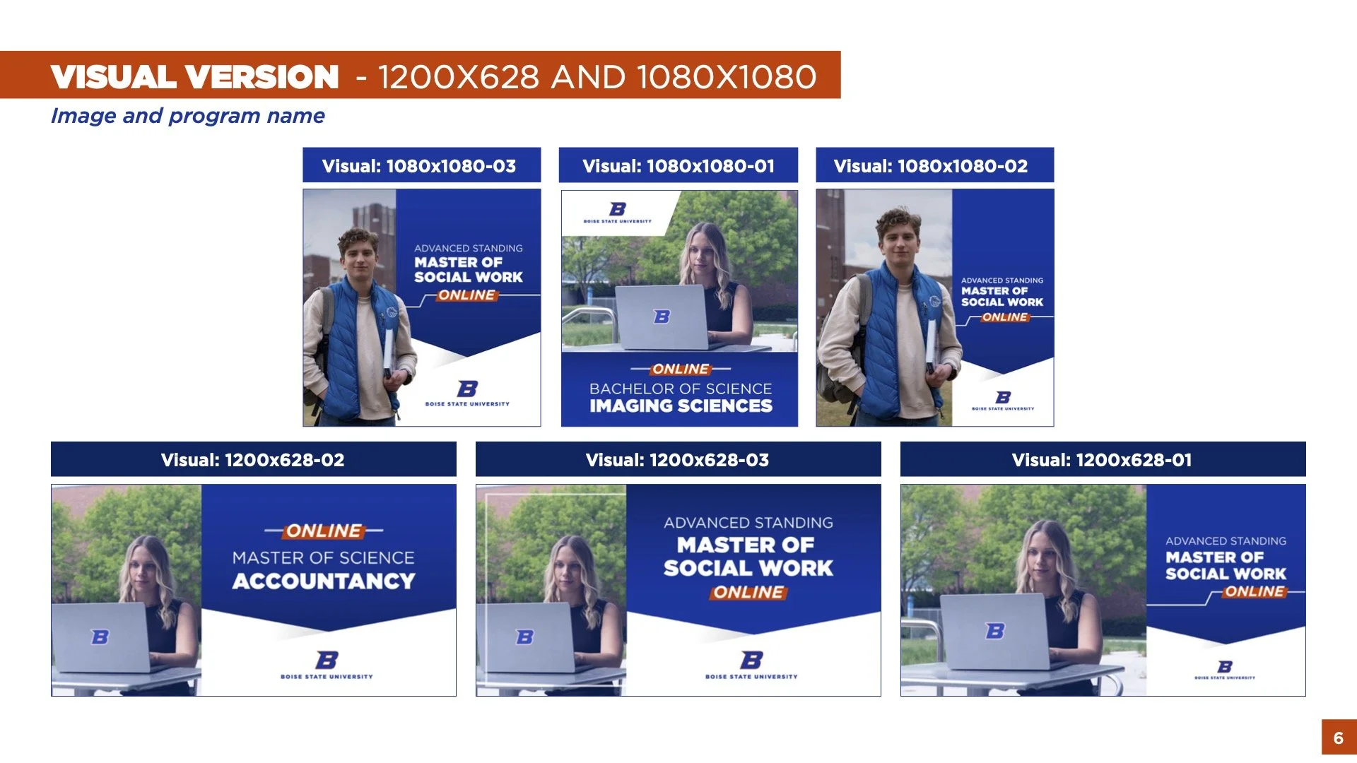
I put together a complete guide for the marketing department to flip through. This way, they could provide feedback and see all of the potential layout options we had in our back pocket. Because these are templates that are meant for all of our programs and images, we decided to make more versions that could accommodate the variation of program names and compositions of photographs.
See a full guide of all layouts below.